Work highlight · Renterii
Rental app re-design
A UI/UX overhaul for a rental startup, from research to mockups.
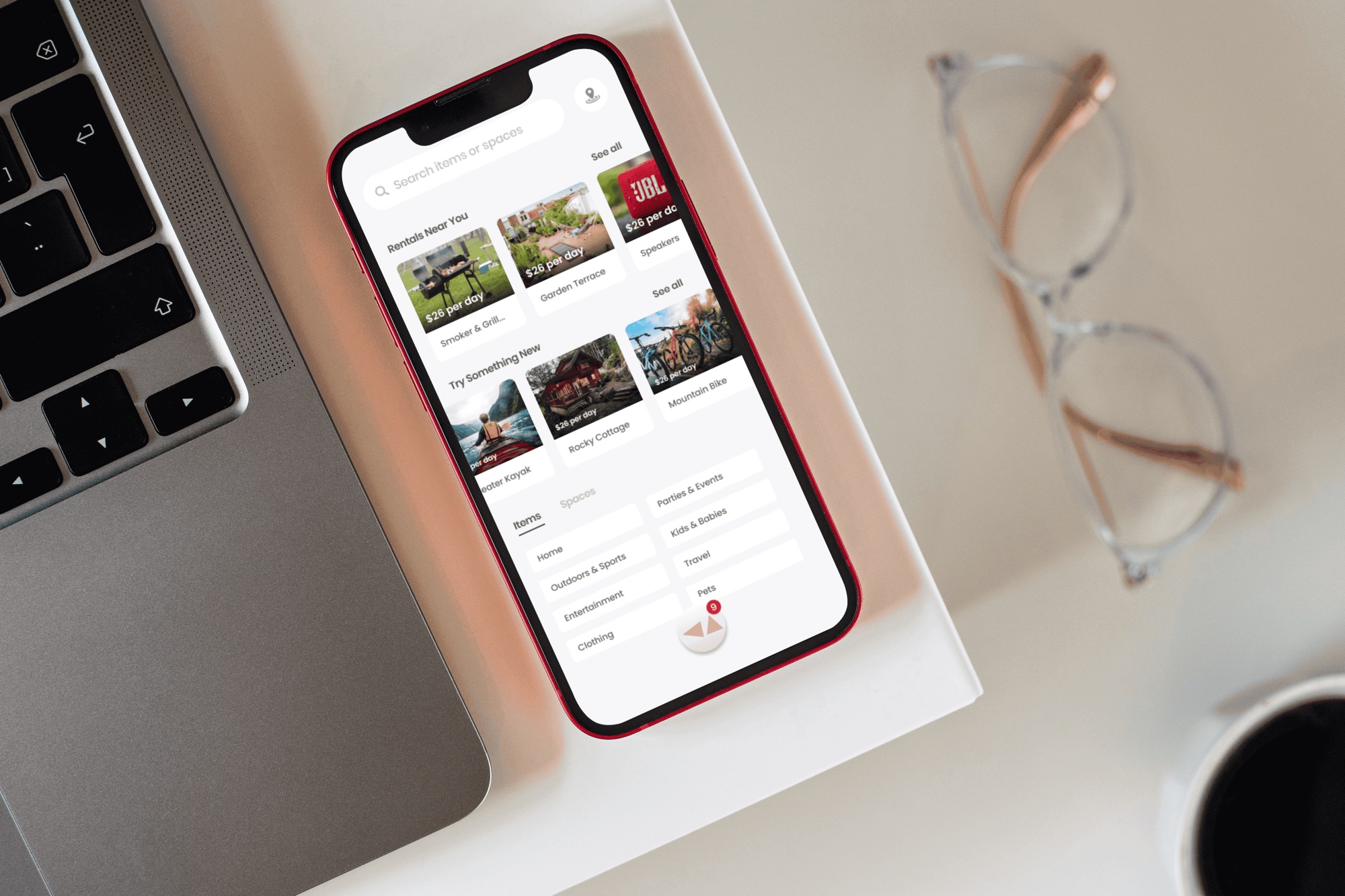
The brief
Issue
- An emerging startup with a barebones application needs a UI/UX overhaul.
- Branding and design are non-existent.
- Product search organization is basic.
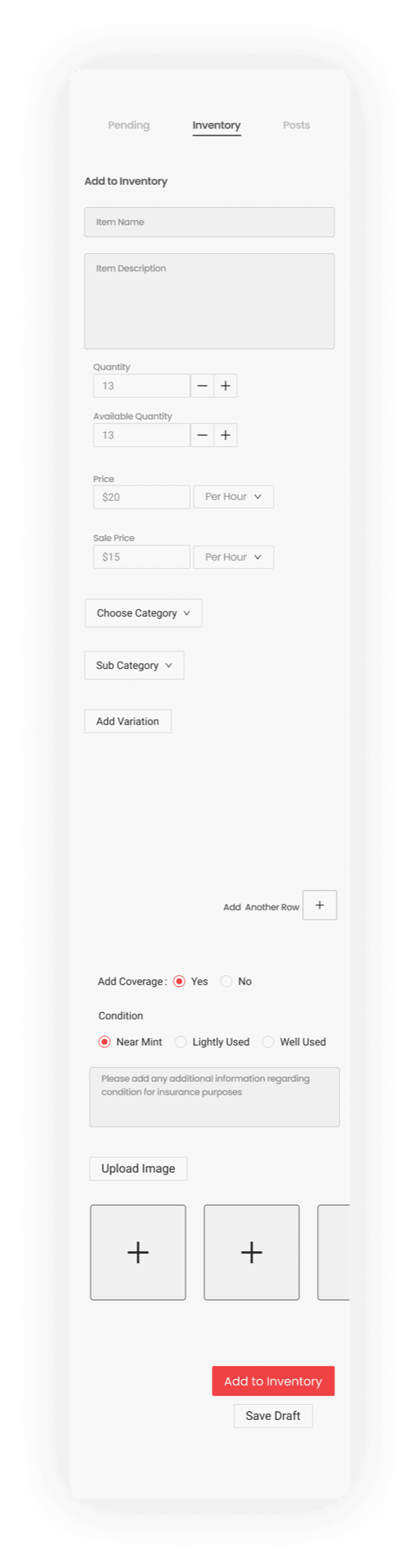
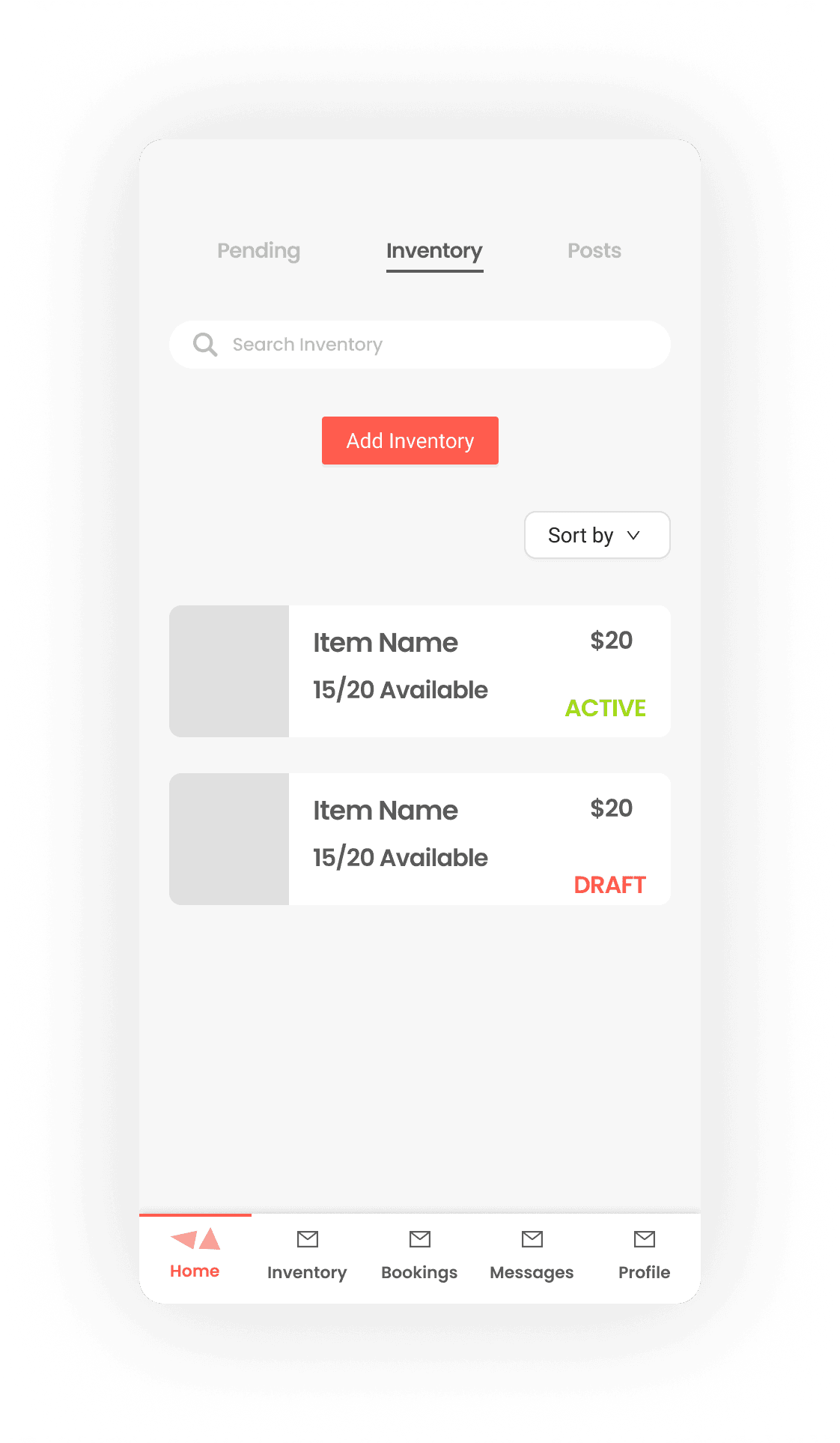
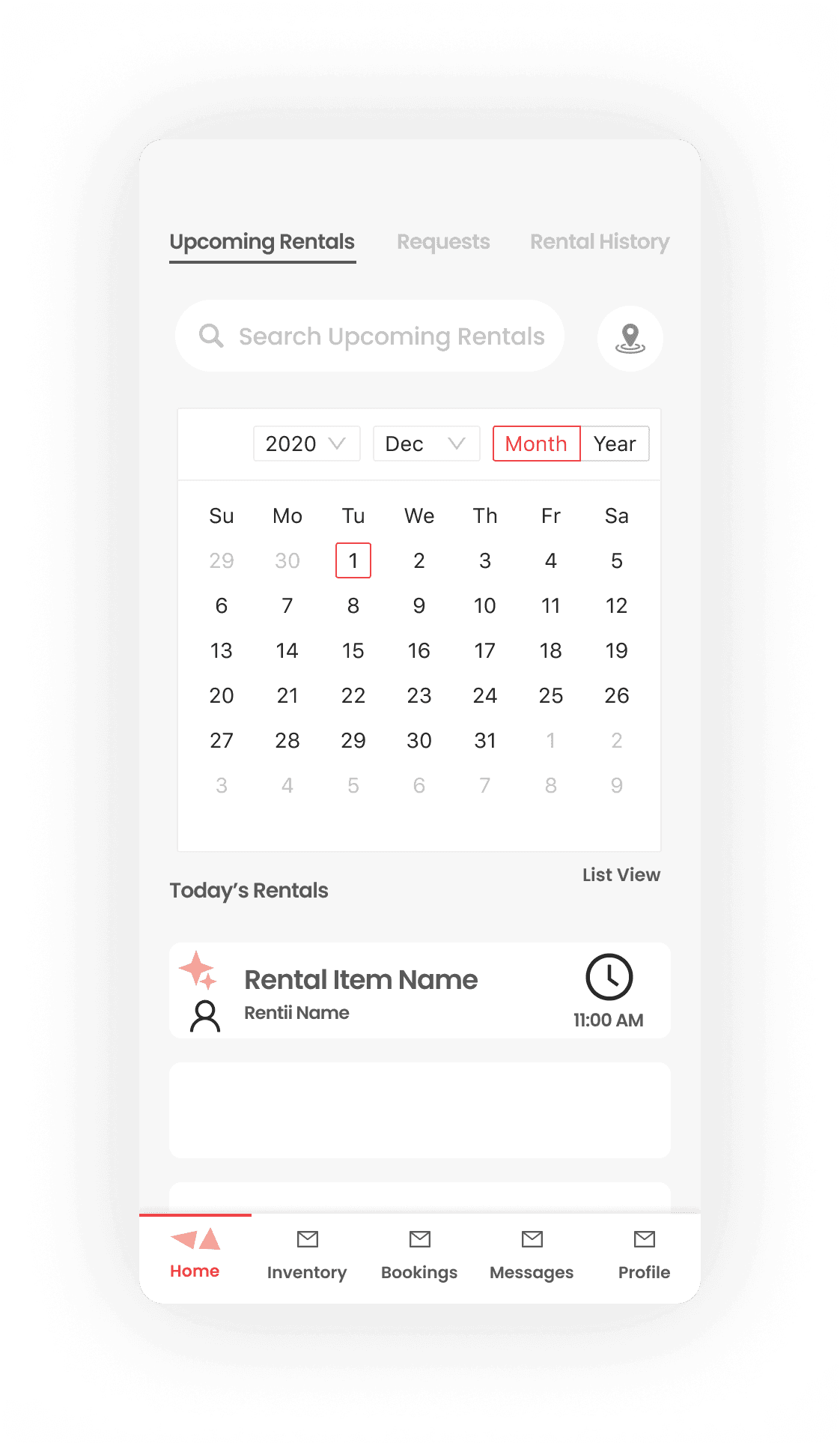
- Renter/rentee organization and communication are causing issues: a user who lists rentals and rents other users’ items has no clear division between the two.
Task
- Audit the existing application to find pain points.
- Research usability and category organization.
- Create basic brand guidelines.
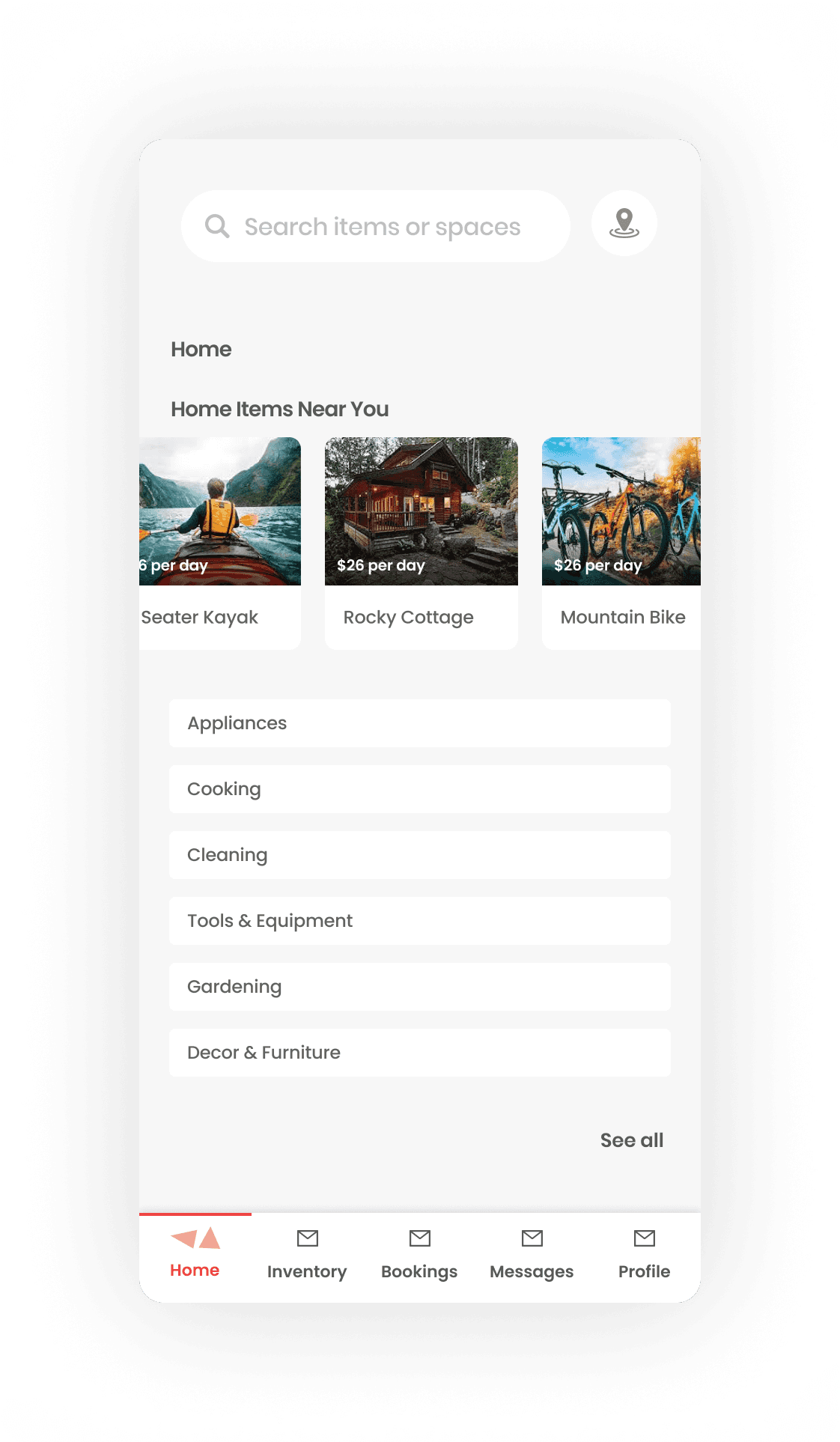
- Mock up a new home page.
Desired result
- Easier communication between users
- A solid design foundation for the product to build on
- Increased user base and engagement
Categories organization
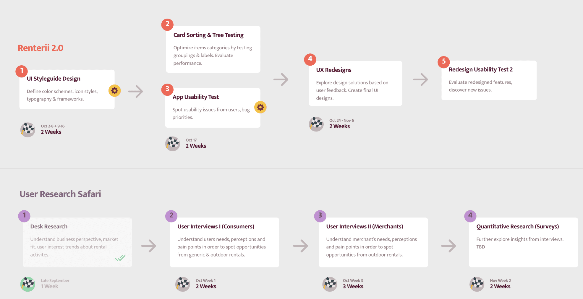
- After auditing the existing application, we created a timeline to address the common issues we found.
- A common issue was that content organization was buggy and nearly non-existent.
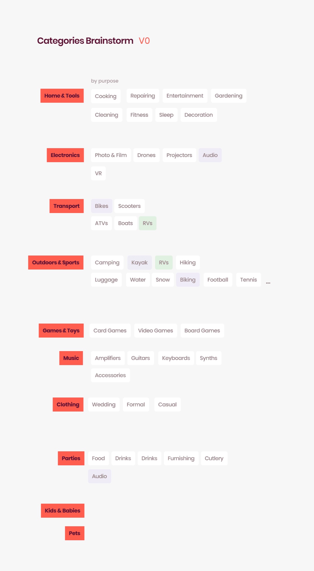
- We brainstormed with the team on how to organize popular rental items, creating a baseline to work from.
Basic rental research
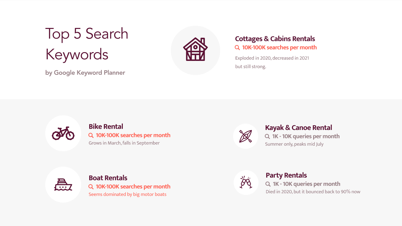
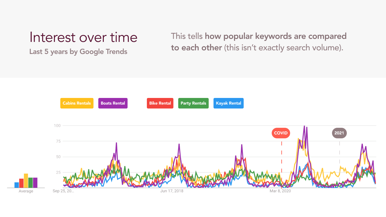
- Popular rental keywords show which items to emphasize and which potential partners to target for growth.
- Fortunately, existing partners have a heavy emphasis on kayak, bike, and scooter rentals.
- How does this affect our design? It narrows down featured content and how item hierarchy can be organized.
Post-research category organization
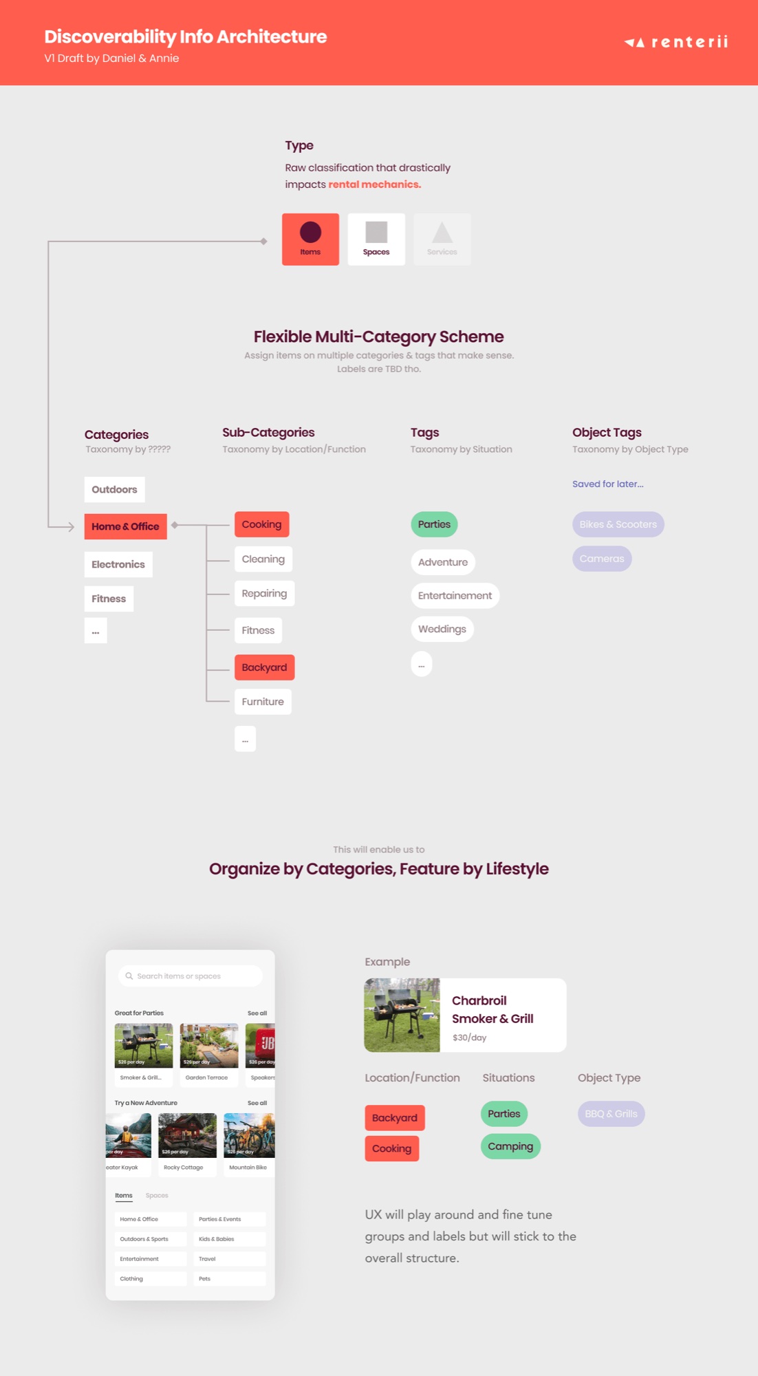
- Category testing with 8 users of varying age, career, and tech comfort showed far fewer categories than our initial brainstorm.
- Users also created “sub-categories”, preferring a funnel of information over a wider initial set of categories.
- Tags cover items that may span several categories and search options.
Starter design system foundation
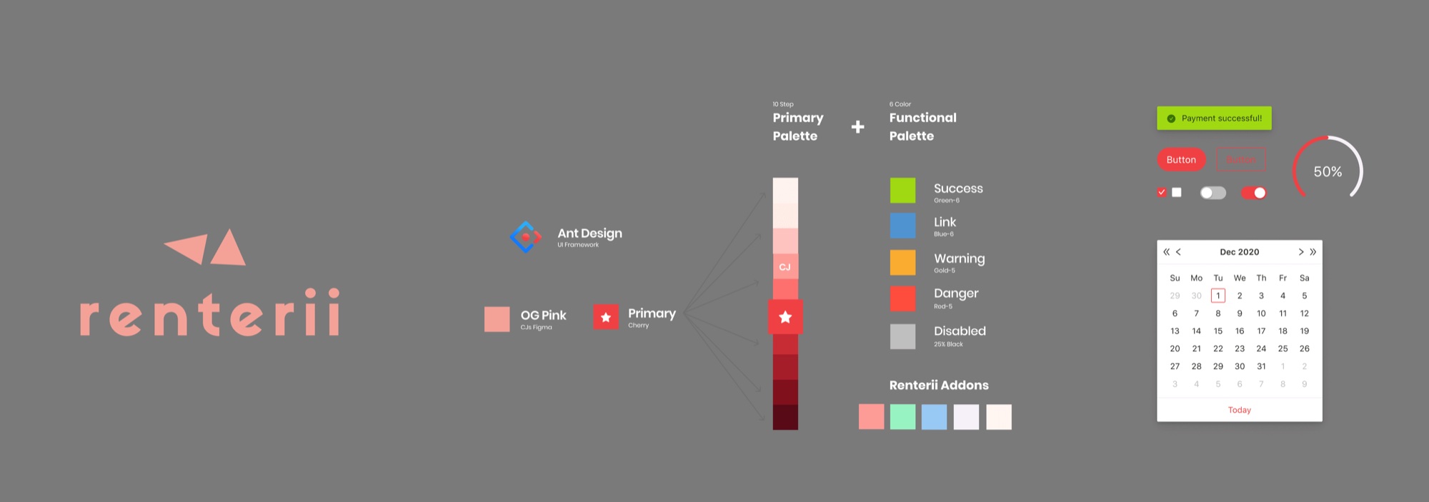
- The existing UI wasn’t WCAG compliant, so I introduced a new primary colour, in line with existing branding, for better visibility and usability.
- Using the Ant Design UI framework sped up the design process and gave developers a baseline to work from.
Mockups
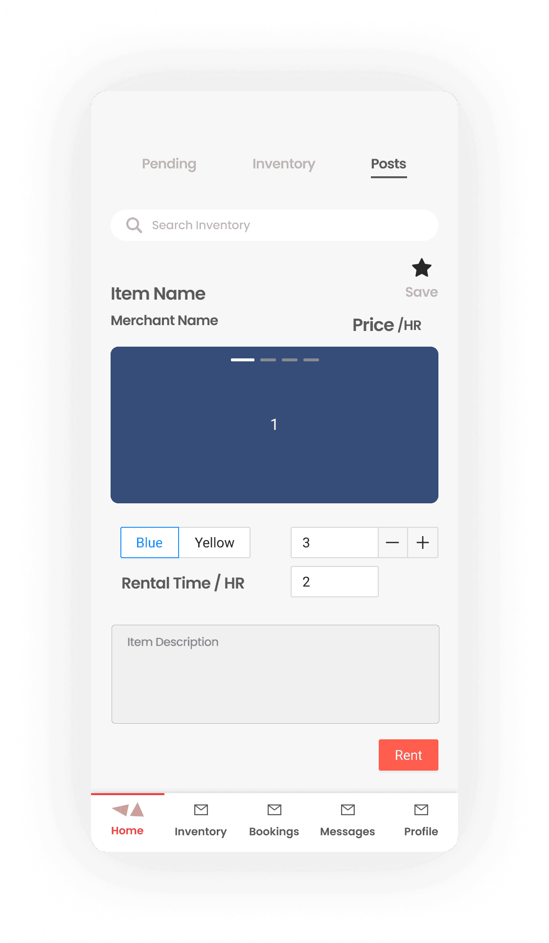
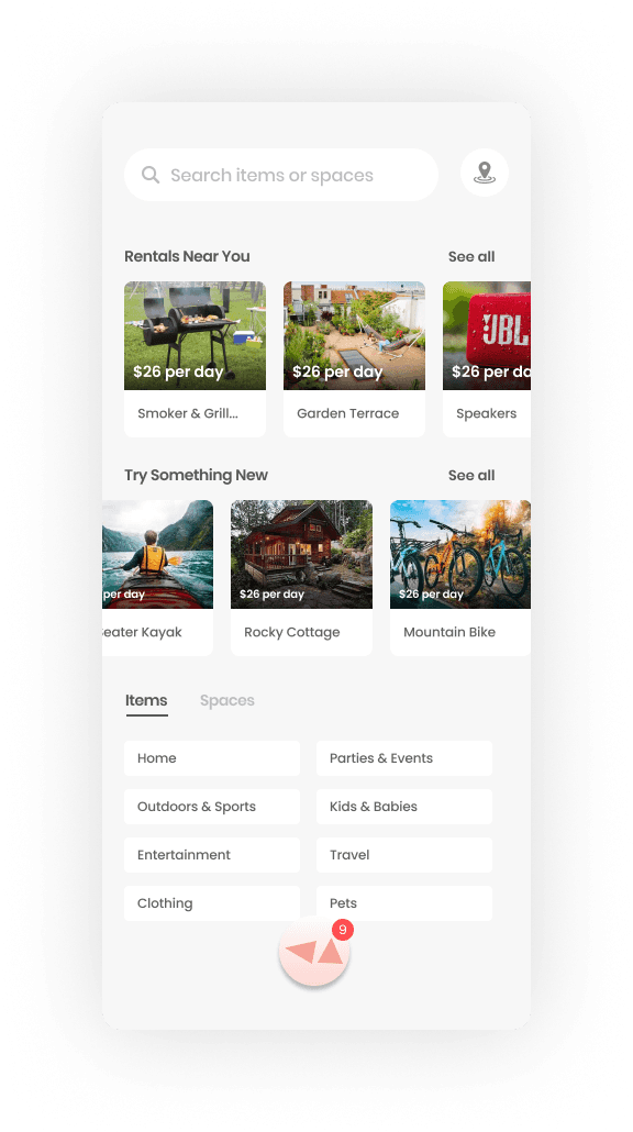
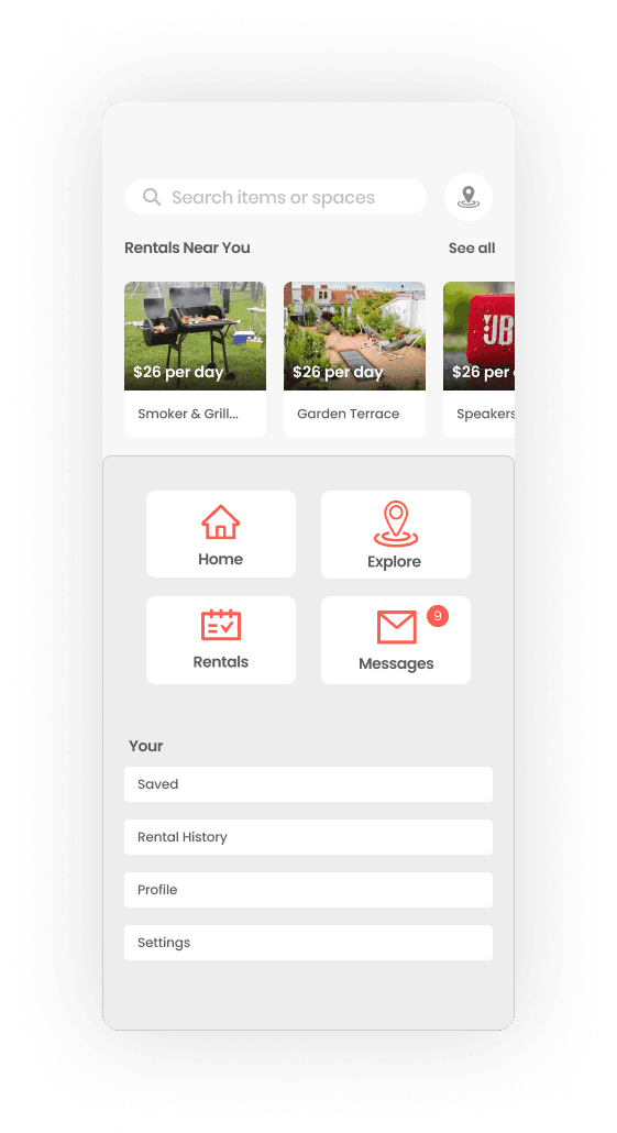
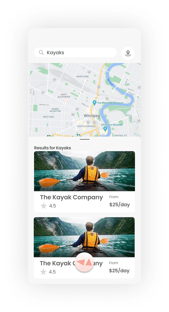
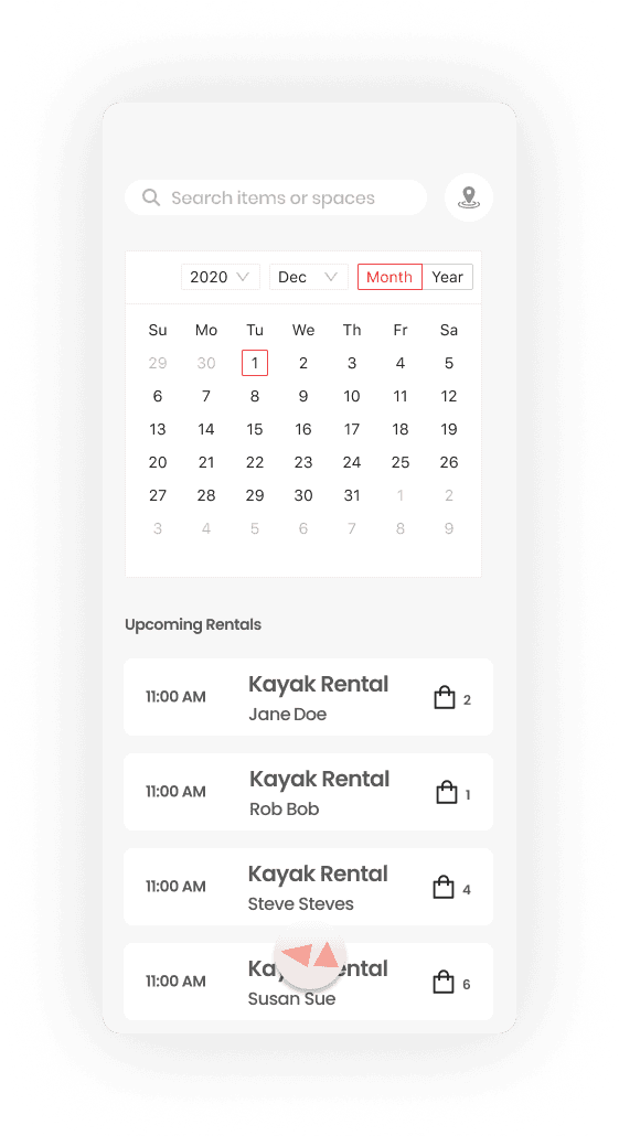
Challenges
- Separating content between rentee and renter resulted in complicated flows.
- Current and projected growth relied on existing businesses that typically rented 1–3 types of items, so separate business and consumer applications would benefit usability and content funnelling.
- Since several tablets were supplied to partners to access the application, my recommendation was to create “Renterii for business” and “Renterii”.
Outcome
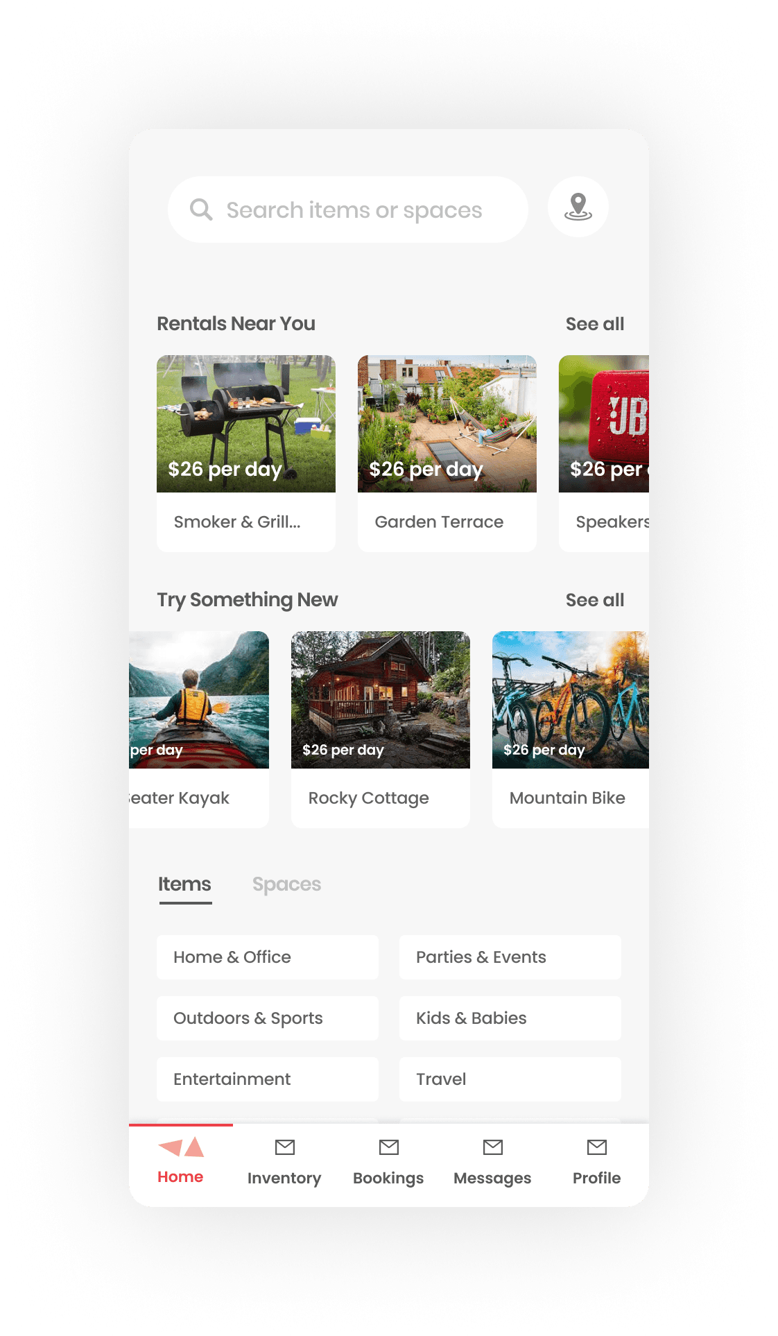
We explored ways to keep the application consolidated for all users, and created a new navigation style that covers the majority of user actions.
After discussion with the C-suite, developing a single application was preferred over separating content.
Development on the design was pushed and, shortly after, halted. Stakeholders returned with input and chose to separate the application into business and consumer versions, which would cost less in time, maintenance, and money over time.
Read next