Case study · RocketRez
Orion: Order details
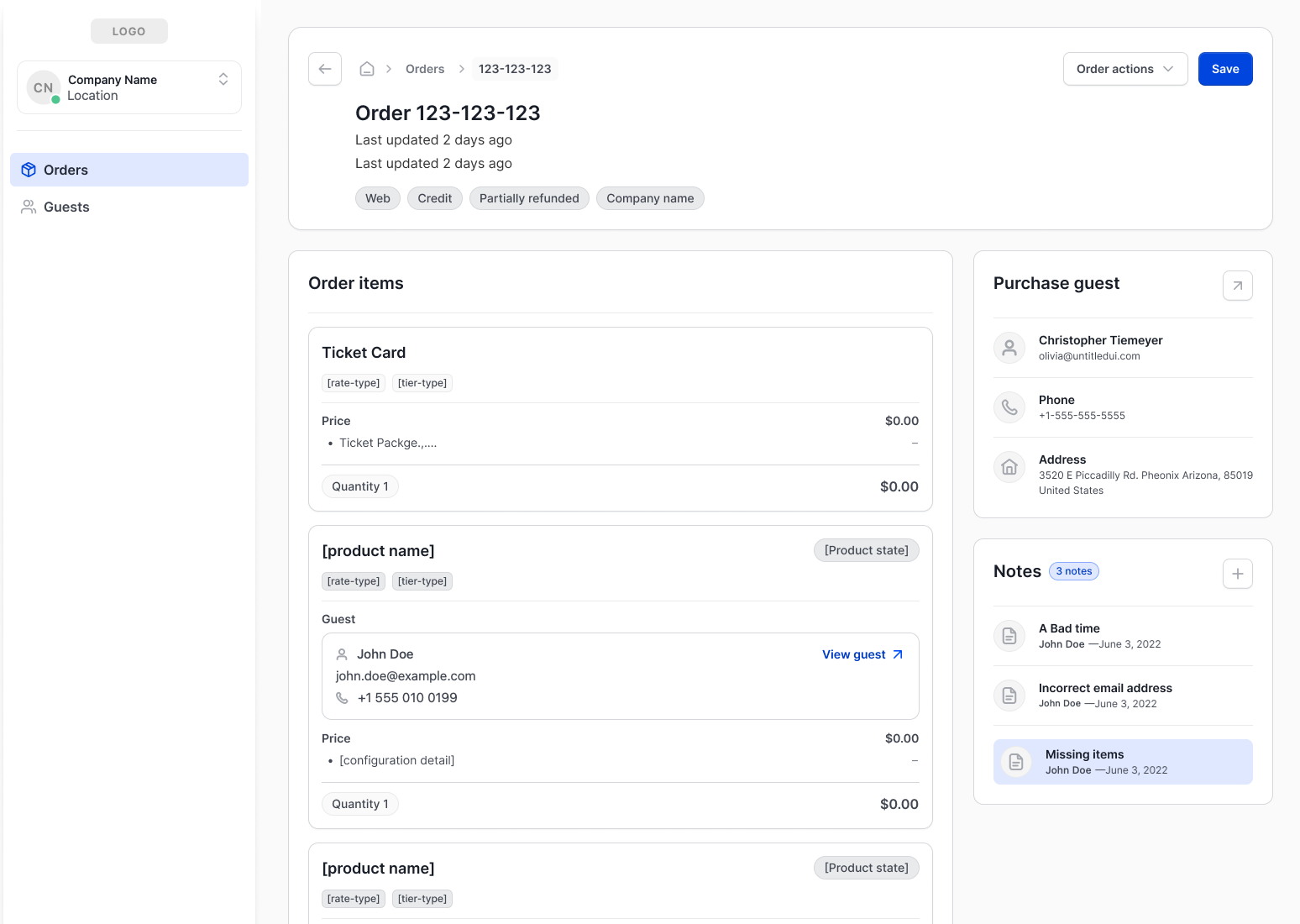
The Orion admin Orders page started as a place to view orders and issue refunds. It grew into the hub for member functionality, refund processing and Stripe dispute status, built piece by piece from a modular “plug and play” design.
The brief
Issue
- Operators needed a place to look up orders and issue refunds.
- Orders are where almost every guest question ends up, so more functionality was going to land on this page over time.
Task
- Meet the customer requirement: a list, an order view, and a refund button.
- Design a page that could handle that growth without a rebuild each time.
Desired result
- A launch small enough to ship
- A clear plan for where each new feature would go
Results
72% down
Financial consolidation and change requests
80% up
Guest complaint issues solved by operators themselves
1.5 hrs a week
Developer time spent on ad hoc issues
Before: about 10 hours a week
These results were measured from June to August. Operators could now fix more problems on their own, so fewer requests reached the team. That freed up about 8.5 developer hours every week for planned work instead of one-off fixes.
Process: from blue sky to launch day
We started with wireframes that set up the page as “plug and play”: a layout made of self-contained sections that could be added, swapped or removed without disturbing the rest of the page.
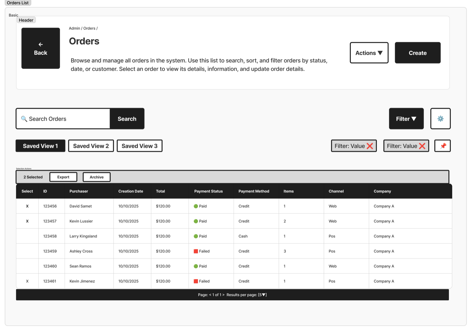
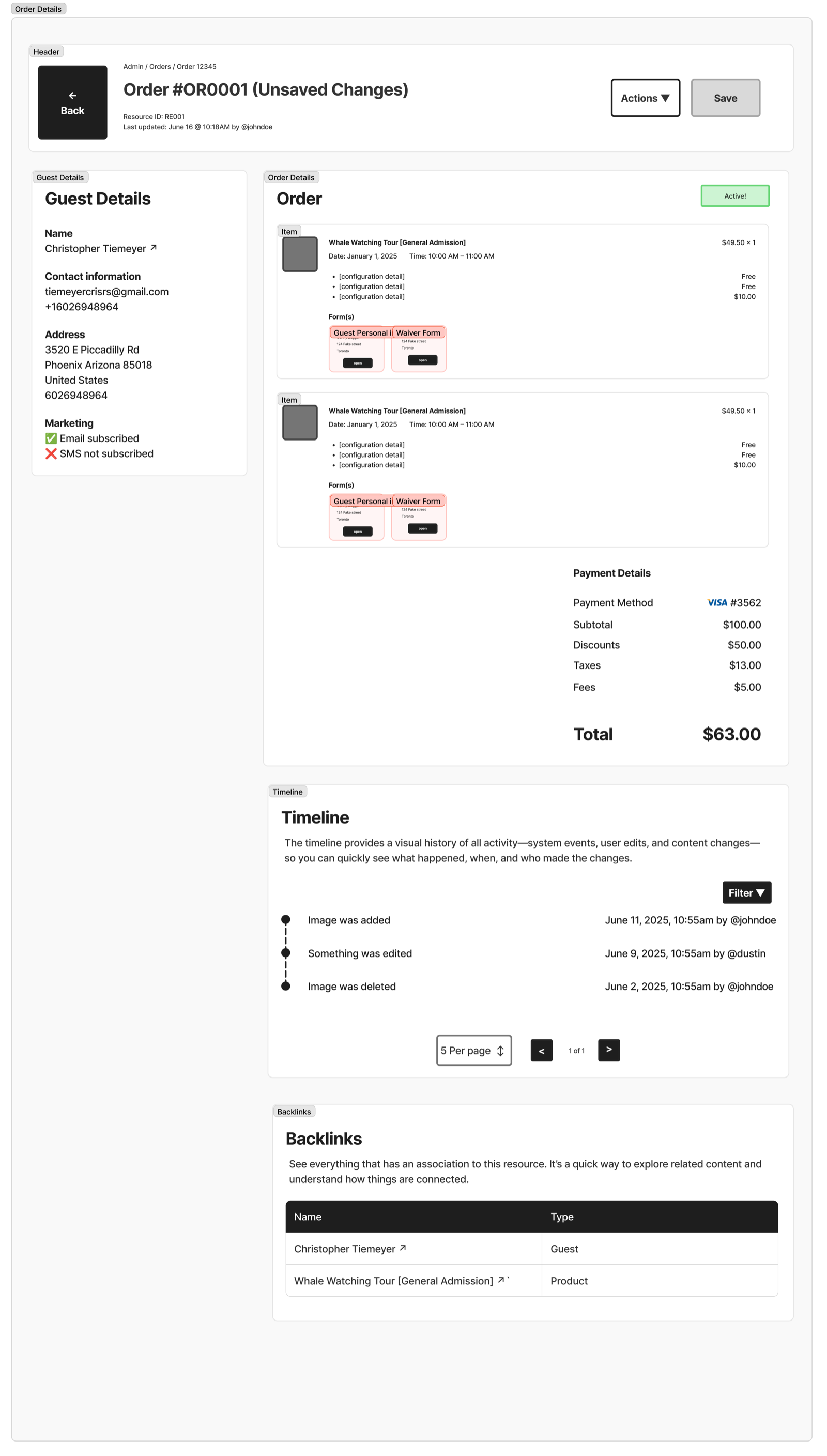
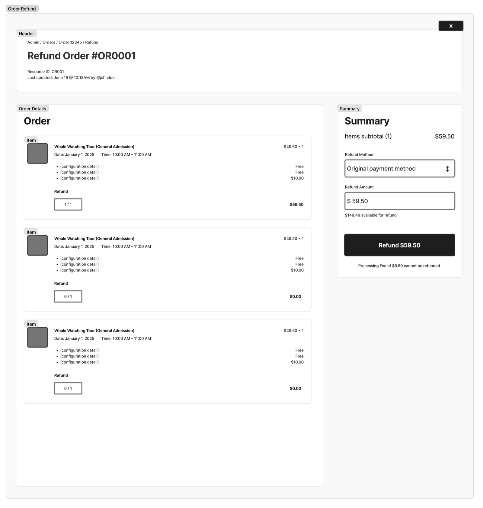
From there we created a blue sky design, showing what the page would look like with no time or engineering constraints. It gave everyone a shared picture of where the page was headed.
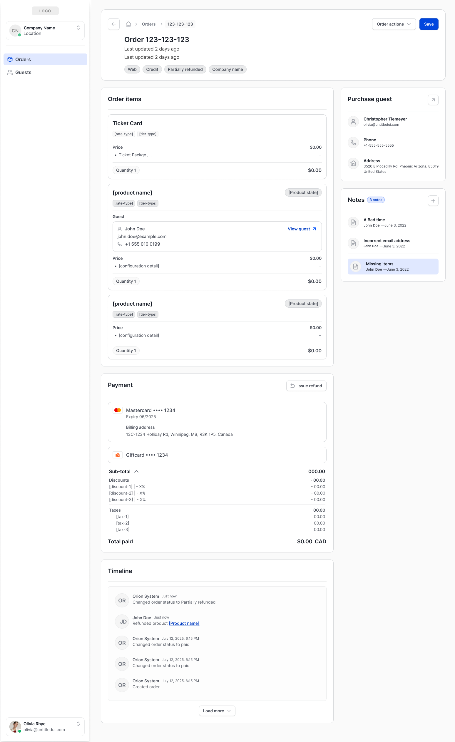
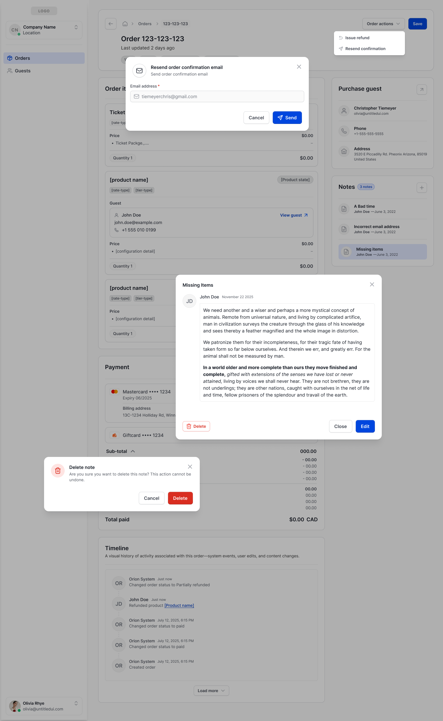
Then we worked backwards. We took that layout and removed everything that wasn’t absolutely necessary for launch day. What remained was the minimum operators needed to do their jobs. After launch, we added pieces back one at a time as real needs came up, always fitting them into the layout the blue sky design had already set.
This gave us two benefits: a launch that was small enough to ship, and a clear plan for where each new feature would go.
Building blocks
We built the page from individual components, each owning one part of an order:
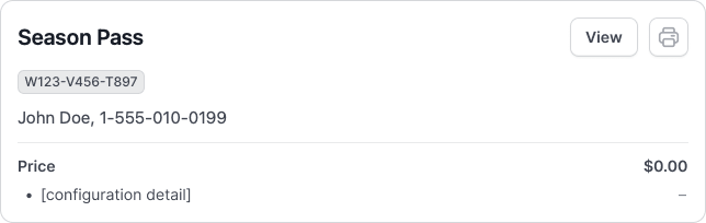
- Product cards for what was purchased
- Guest detail cards for who the order belongs to
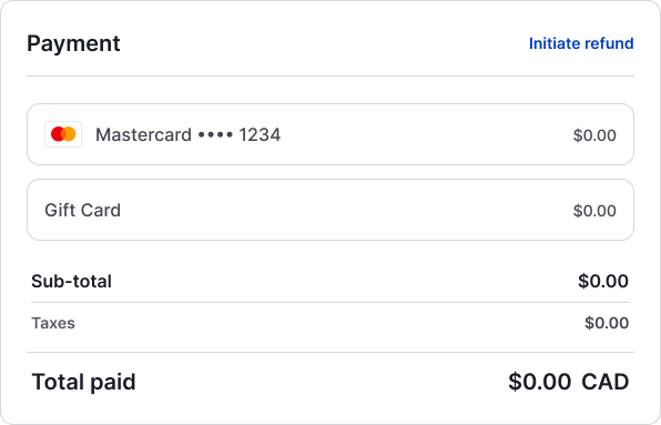
- Payment detail cards for how it was paid
Because each card stood on its own, new functionality could plug into the card it related to, or arrive as a new card, without reworking the page. This is what made the step-by-step build after launch possible.
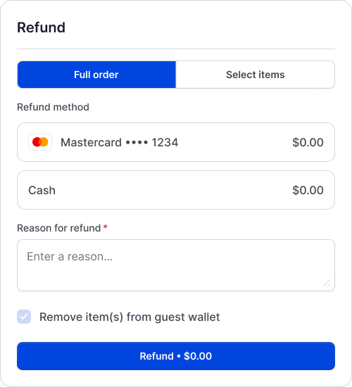
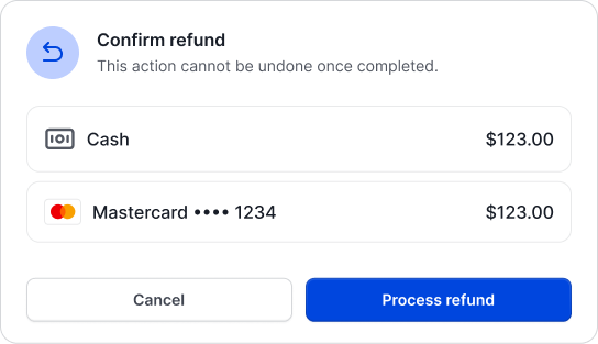
Refunds: separating money from access
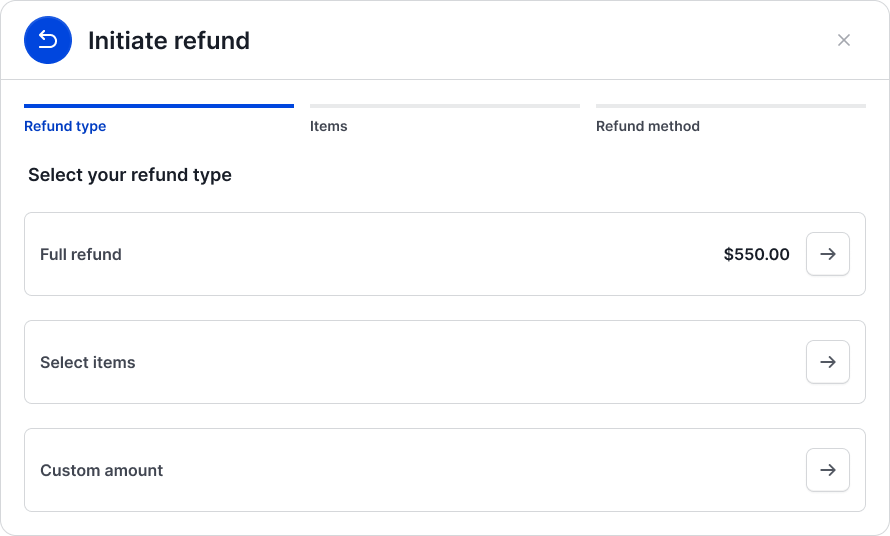
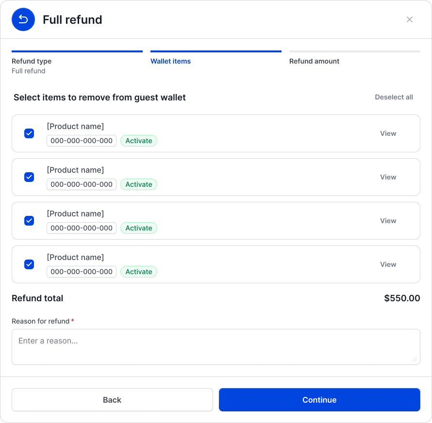
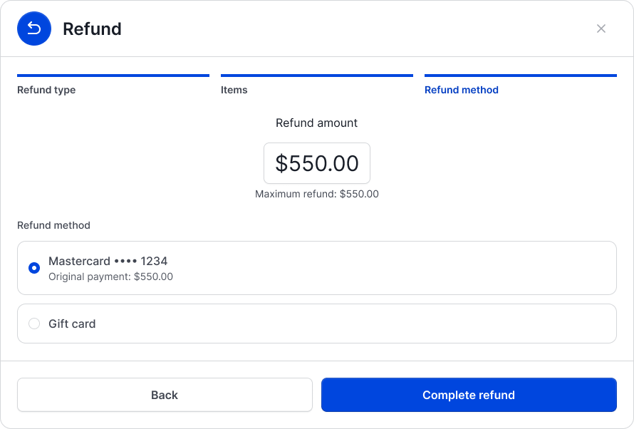
As functionality expanded, refunds became the most complex part of the page. The first need was straightforward: full order refunds and partial order refunds, where operators refund some items and leave the rest of the order intact.
Real operator situations quickly went further. Sometimes an operator wants to refund a guest but still let them use what they paid for, for example as a goodwill gesture after a bad experience. The opposite is also true: sometimes items need to be removed from a guest’s access without any refund at all.
That meant treating the refund and the guest’s access as two separate decisions, instead of assuming one always comes with the other.
Once these were separate, every refund case fit into the same model, and operators could handle unusual situations without workarounds.
To work through the more complicated flows, we started with a general low-fi layout, then used Claude Code to prototype the flow end to end. That let us check it was usable and consistent with what we wanted operators to achieve. We then pulled the pieces of the prototype we liked into the new refund flow components.
Stripe dispute status
When a guest disputes a charge with their bank, operators need to know before they act on the order. We brought Stripe dispute status onto the order page as a status badge.
Stripe reports disputes with a long list of technical statuses that mean little to an operator. We grouped them into three states operators actually care about: In Progress, Lost and Won. Refund actions are gated by the dispute’s state, so the order page guides operators away from refunding money that is already being contested.
Challenge: last-minute launch requirements
The barebones version was planned in phases, but as launch day got closer, new requirements kept arriving: “Oh, and we forgot this is necessary for launch.” Many of them would have needed much heavier design work, pulling the layout and user flows into the advanced future state from the blue sky design. There wasn’t time for that.
The real challenge was defining what was realistic. For each request, we had to find a version that satisfied the client without rebuilding the whole layout.
We bought time with roundabout solutions. They worked, but they added steps to operators’ flows:
| Launch requirement | What we shipped | The trade-off |
|---|---|---|
| Refunds at the counter | Refunds handled on the admin side, not the Point of Sale | Operators had to leave the POS to complete a refund |
| Flexible refunds | Refunds by item or full order, back to the original payment method only | Other refund cases had to wait for later phases |
| Membership and guest information | Added as note components inside the order page, since no full guest details page existed | Guest details lived on each order instead of in one place |
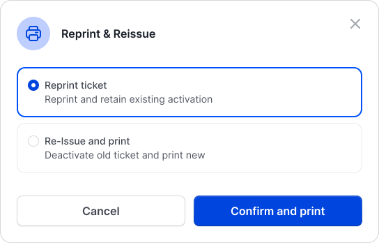
Our first-pass components made the problem visible. Reprinting and reissuing tickets, refunding across payment methods, and removing items from a guest’s wallet were all landing on a page built to view an order and start a refund. The order details page was no longer just somewhere operators went to initiate a refund.
After launch: improving without rebuilding
After launch, we had time to think properly about how these flows should work. Because the page was built from self-contained components, we could isolate one flow at a time and improve the components behind it.
That is how the page expanded: operators can now view a ticket’s history, suspend a membership instead of deactivating it, and handle more kinds of refunds, each built into the card it belongs to.
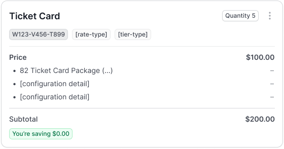
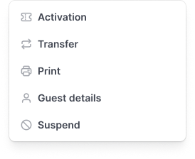
Operators kept interacting with the page the same way. The improvements landed inside a layout they already knew, instead of arriving as a redesign they had to relearn.
Where it ended up
The page that started as “view orders and refund” became the operator’s central place for handling an order: member functionality, a full set of refund processes, and Stripe dispute status, all in one view.
It grew without a redesign because of decisions made at the start:
- Design the destination, ship the minimum. The blue sky design set the direction, and cutting it back to launch essentials let us ship early without losing that direction.
- Build in self-contained pieces. Cards for products, guests and payments gave every new feature an obvious home.
- Model the real decision, not the assumed one. Separating refunds from access covered cases a simple refund button would have forced operators to work around.
Read next