Case study · Neo Financial
Member portal
Turning a stretched mobile layout into a real web experience.
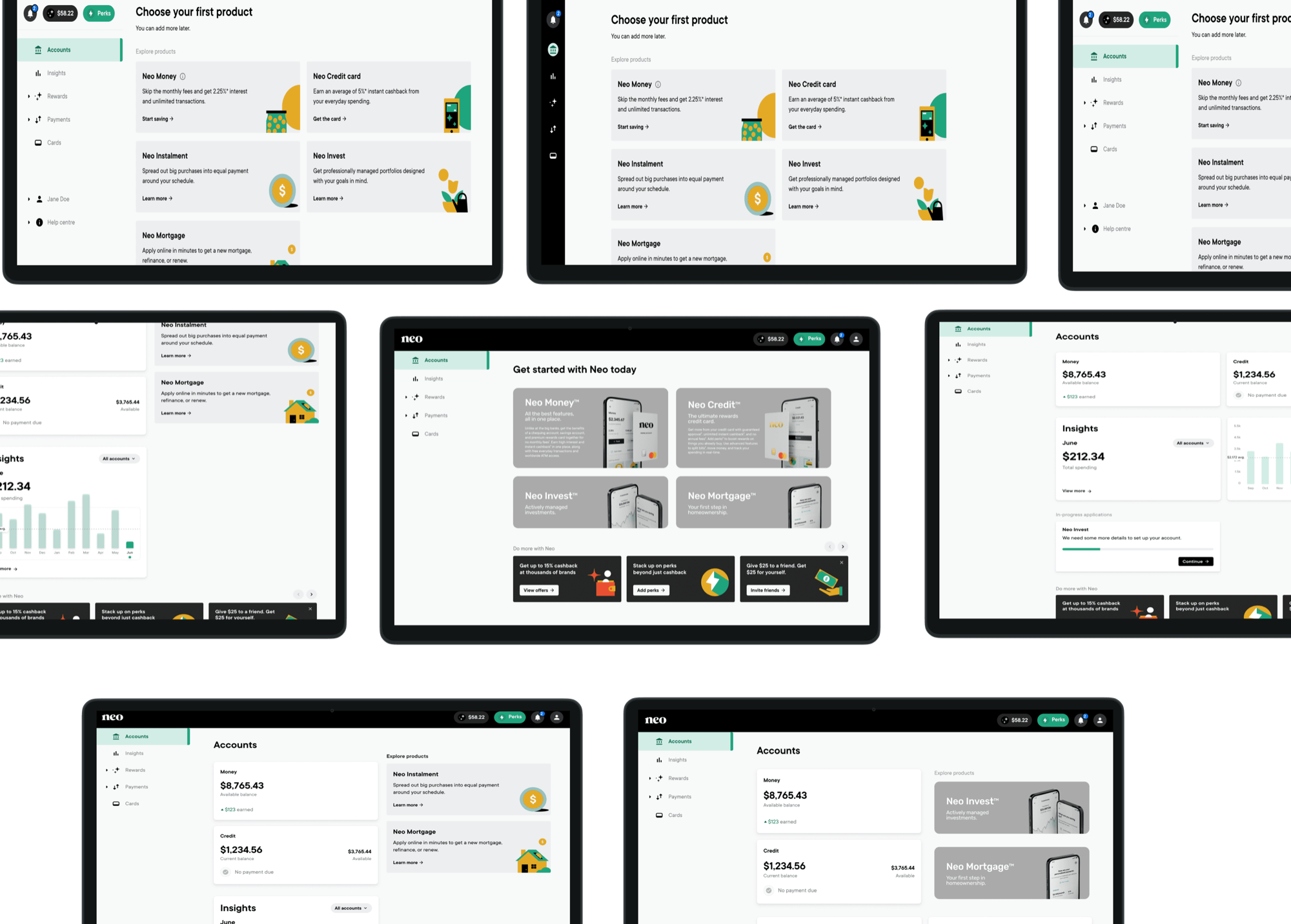
The brief
Issue
- The member portal doesn’t have an optimized web experience: it takes the mobile experience and expands it for wide screens.
- That limits the user experience, doesn’t capitalize on space, and feels like an afterthought.
- Inconsistent UI across pages.
- New products mean new branding that doesn’t get updated on web.
Task
- Audit the existing member portal to find inconsistencies and areas of improvement.
- Research competitors and alternate layout styles.
- Create a standardized information hierarchy.
- Provide a navigation refresh more consistent with current branding.
Desired result
- A unique web experience
- Modernized look and feel
- Increased user engagement
- Growth of user base
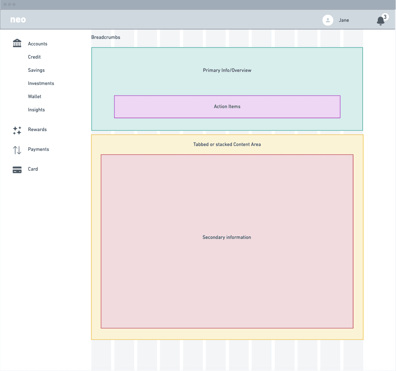
Navigation and layout considerations
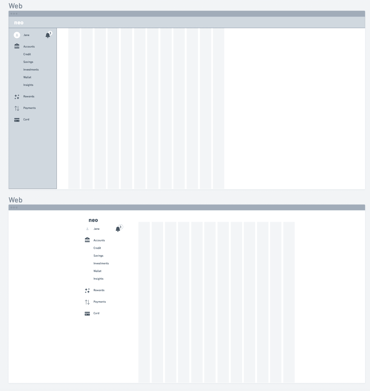
- An updated navigation enhances the web experience across multiple screen sizes.
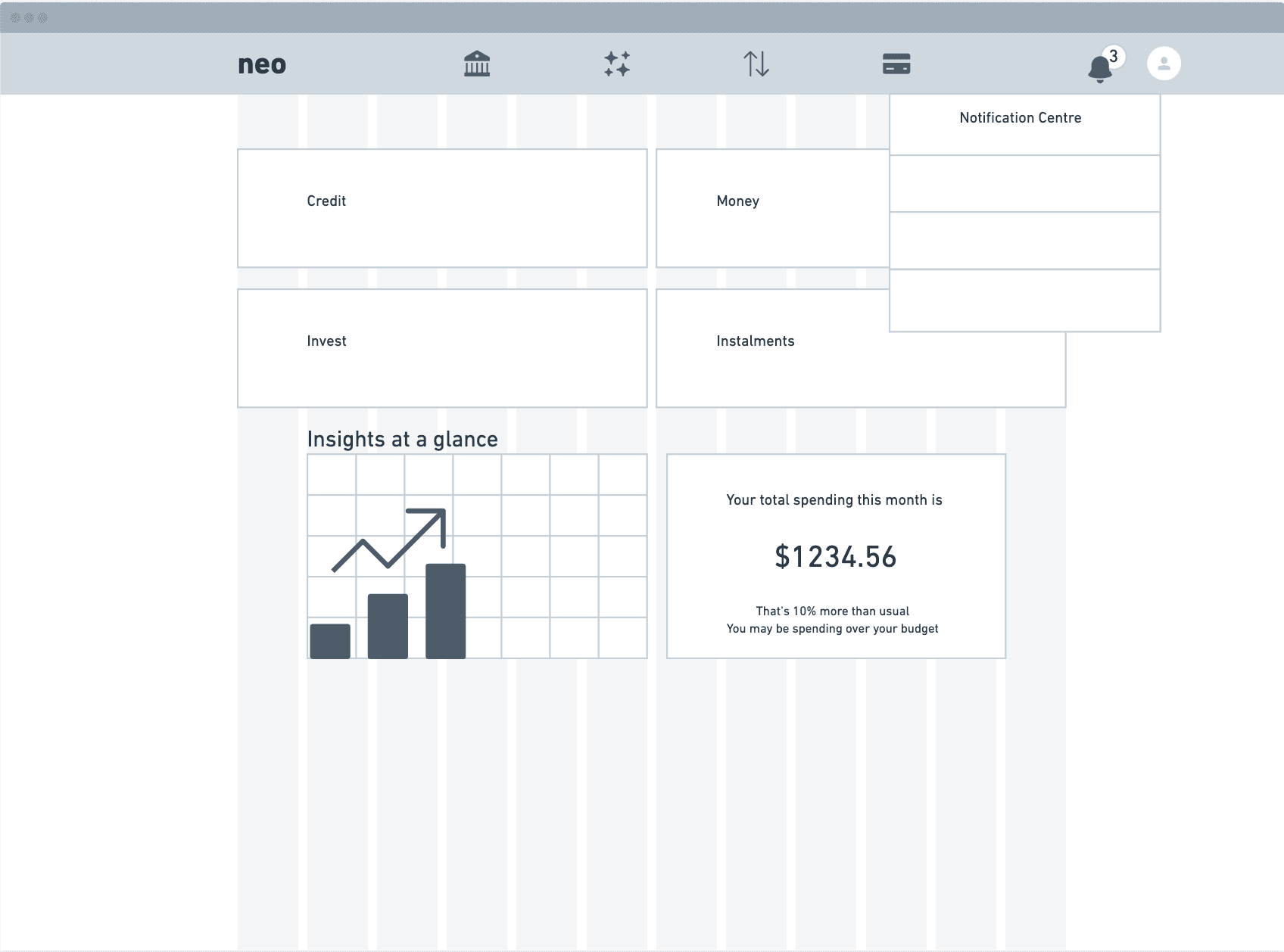
- Several competitors use a top navigation, and switching to one could be beneficial for information growth and exploration.
- An audit of the existing member portal showed inconsistent UI and navigation across pages.
New layout considerations
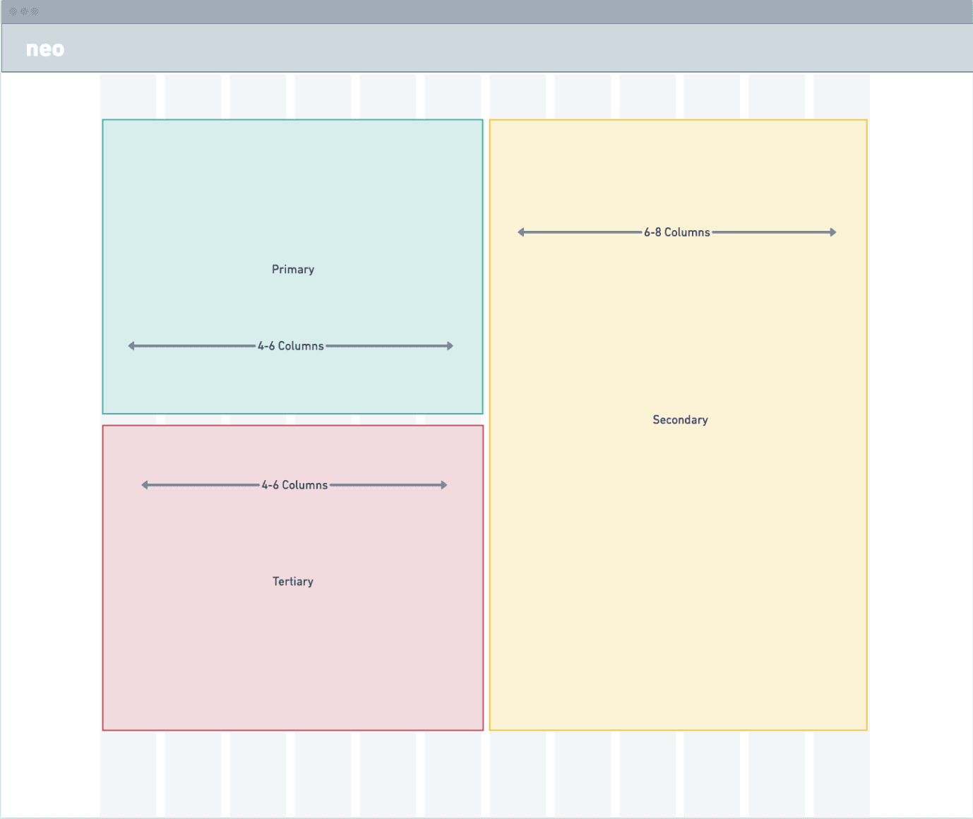
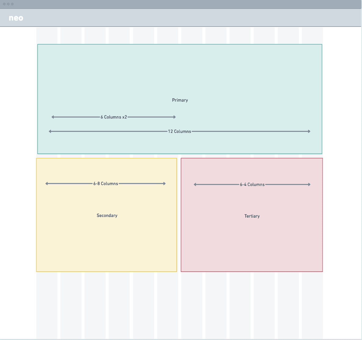
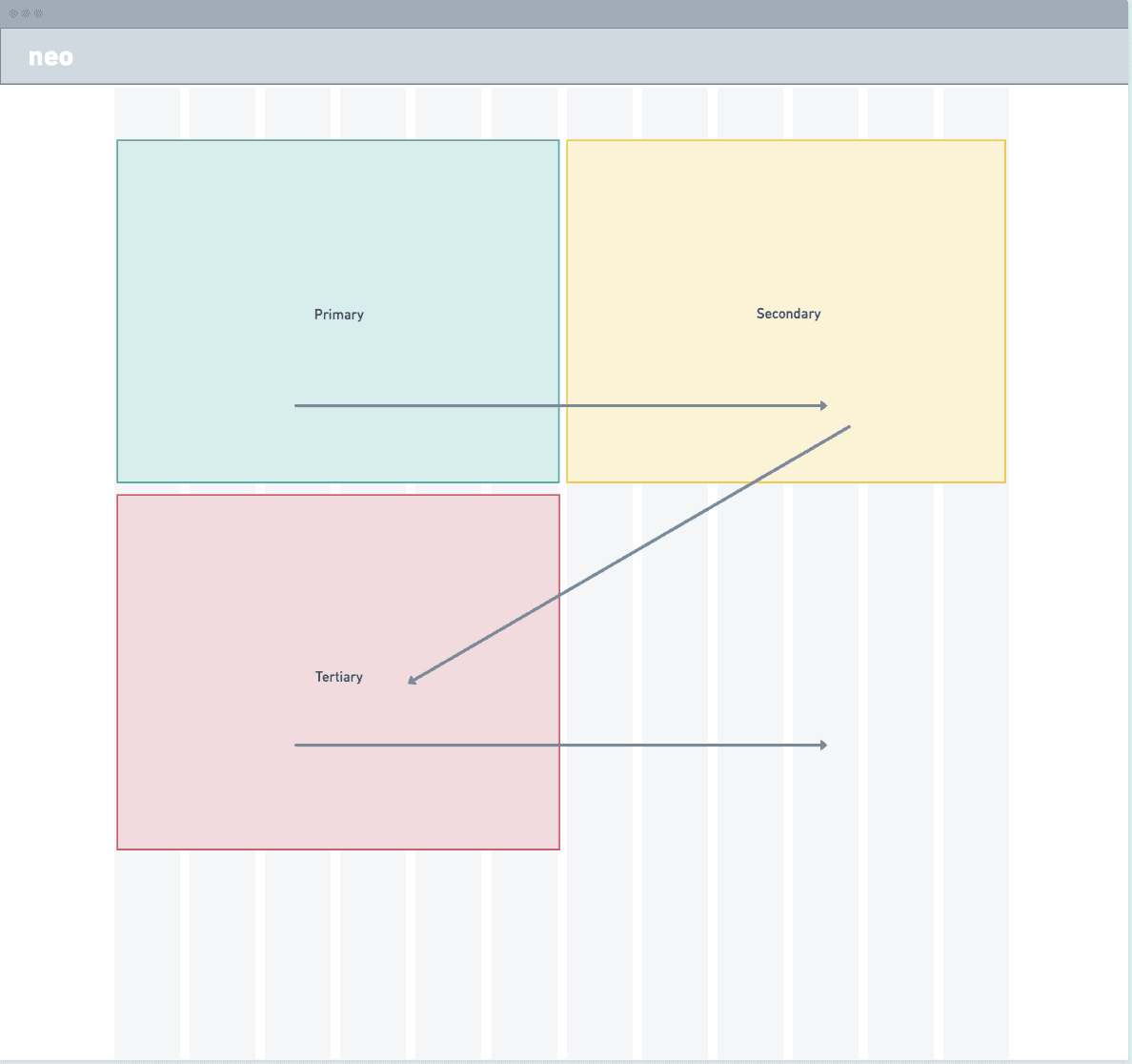
- Clearly defining and documenting what is “primary”, “secondary”, and “tertiary” content.
- An updated grid and information hierarchy enhances user exploration.
- Users see the most important content first.
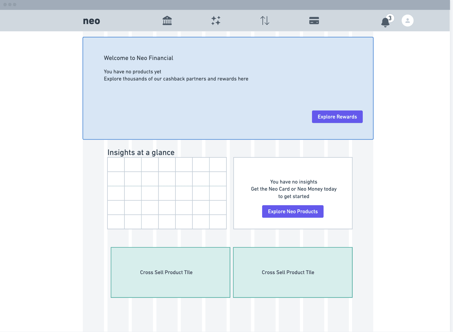
- Marketing tiles are optimized to be more effective.
Tile implementation
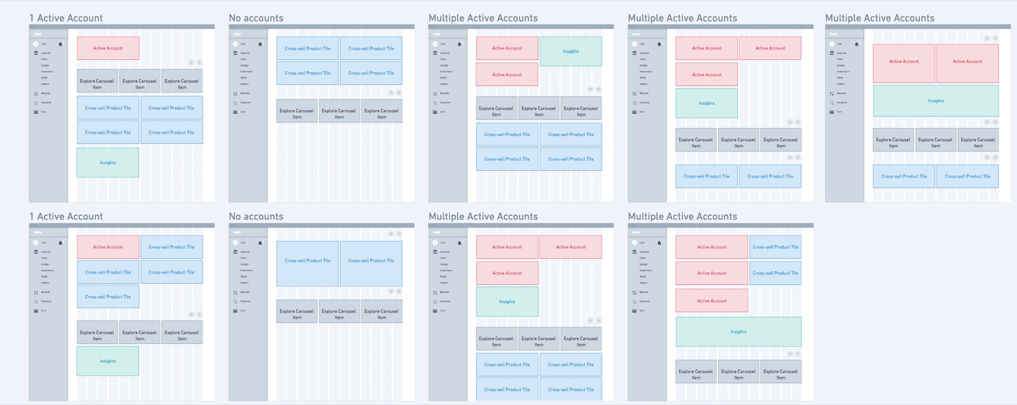
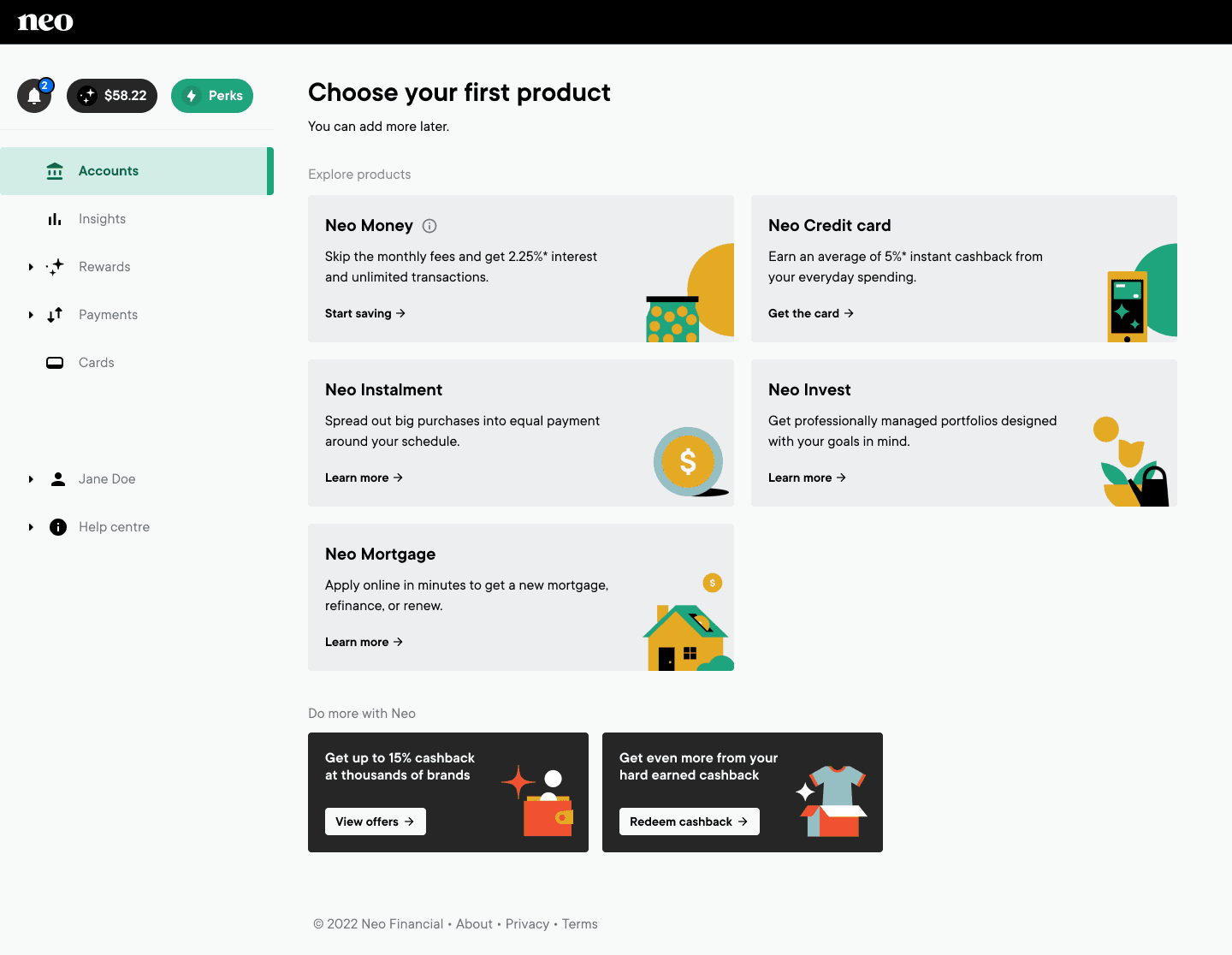
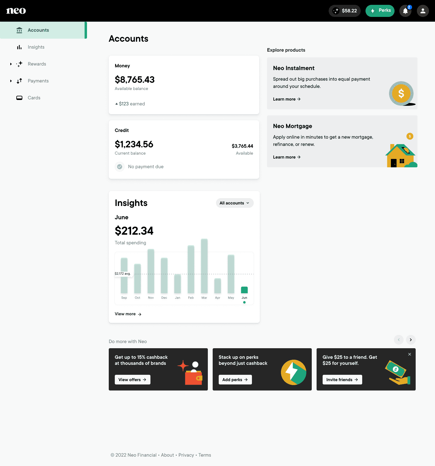
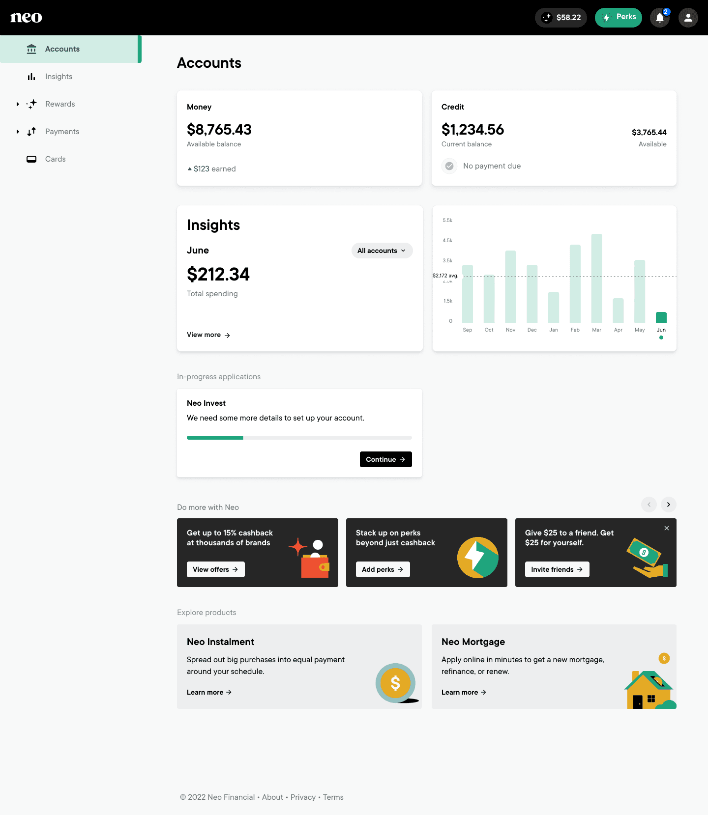
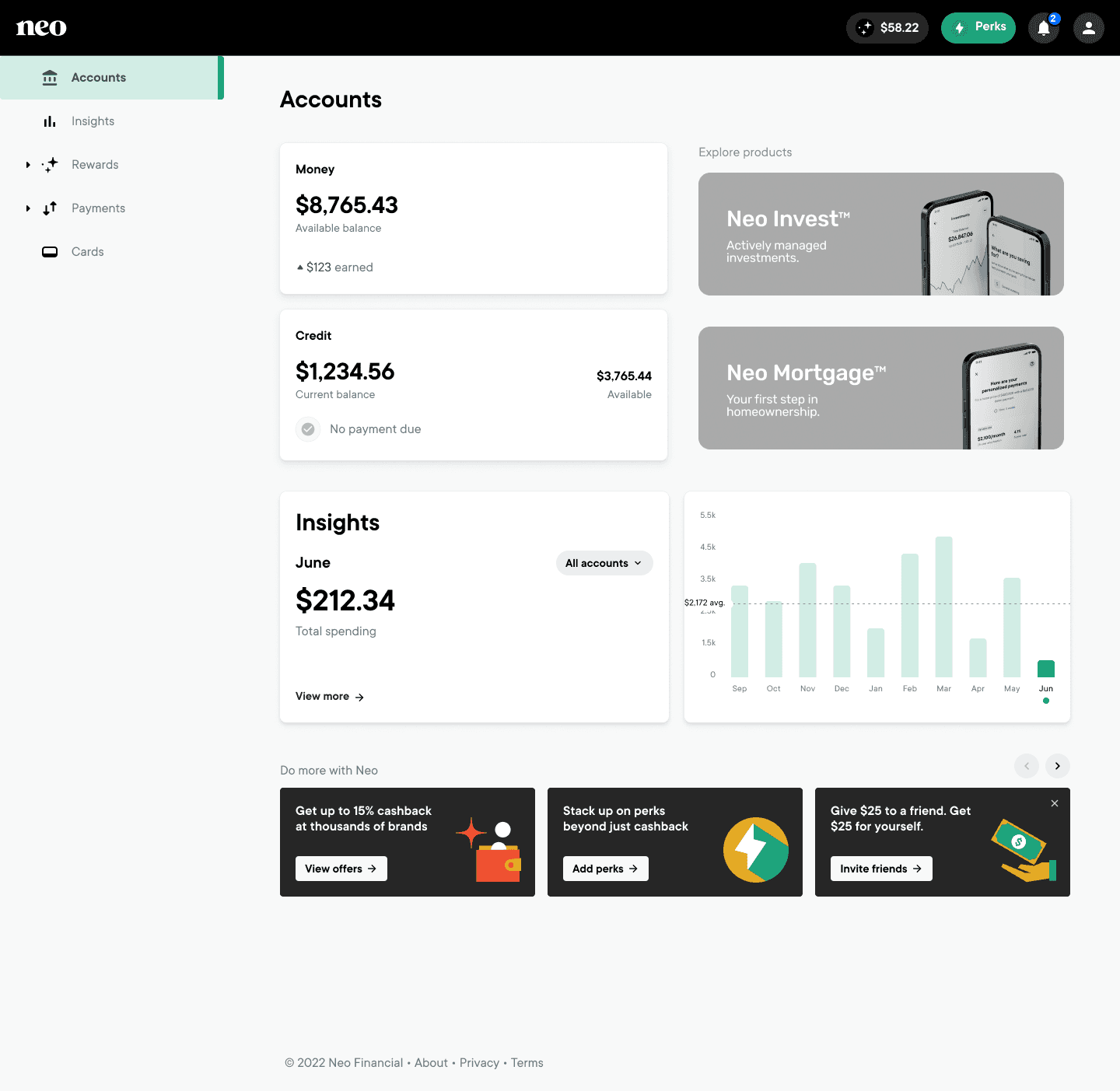
- Low-fi brainstorming to see which layouts and tile placements are most effective.
- Takes into consideration the various account states across the user base.
- Visual side-by-side comparisons let the team see the pros and cons of each option.
Outcome
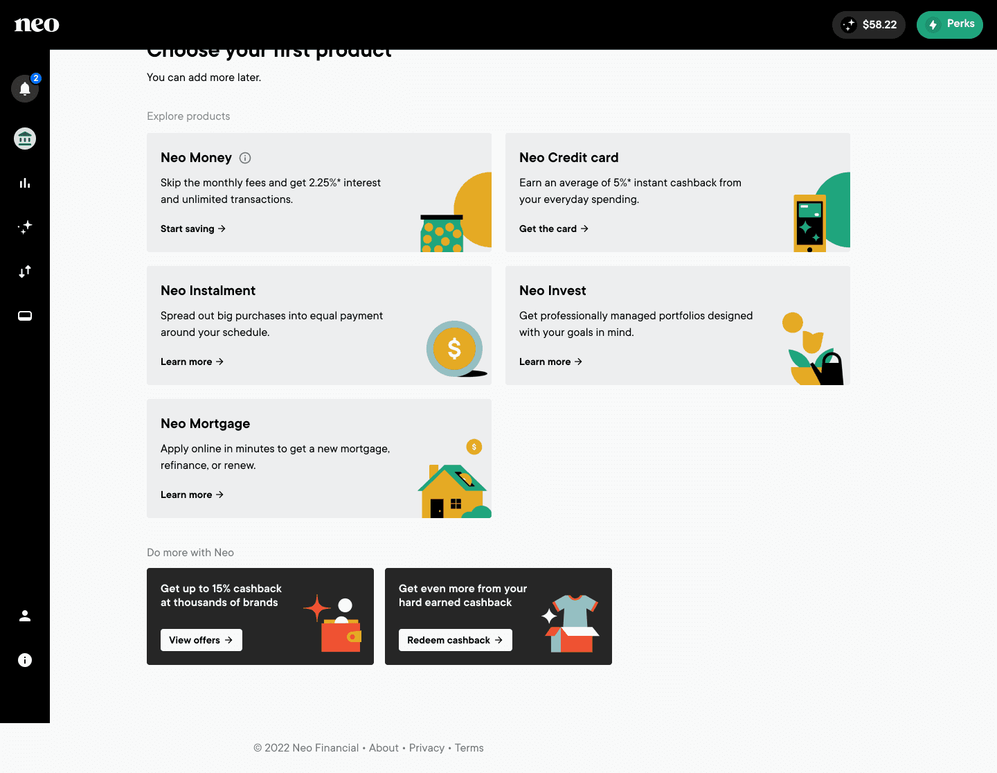
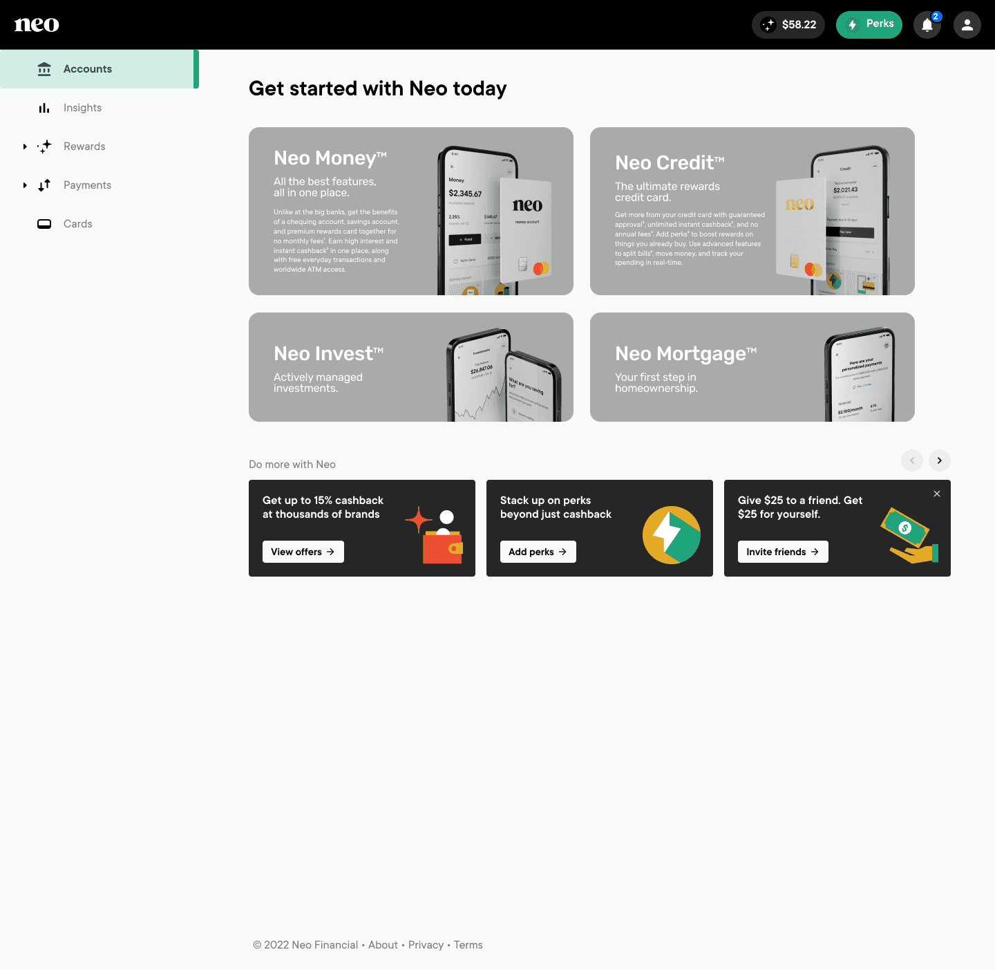
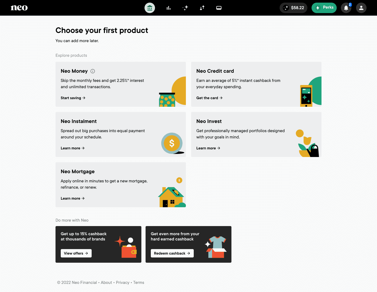
- Navigation has been updated to be more consistent with new branding.
- Content hierarchy has been defined, and the company has seen an increase in user engagement.
- Grid updates have improved usability across screen sizes.
- A larger UI overhaul and content re-organization has been postponed in the pipeline, as B2B work took priority.
Read next